Access Management Dashboard
Cloud Audit — a unified way to see who has access to what, and whether they should. Built to turn weeks-long security reviews into a 5-second check.
The problem
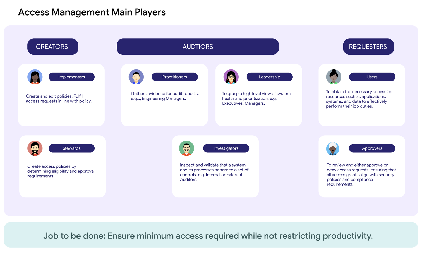
Former Cloud data & systems were managed by multiple disjointed access management tools.
Cloud Googlers use dozens of tools on a regular basis to get their jobs done, and their access was tracked by hand. Security and compliance teams stitched together spreadsheets to answer a basic question: who has access to what, and should they still? A single audit took weeks. Roles drifted quietly out of sync with reality, and over-provisioned access piled up in the background.
The approach
One dashboard, every system, always current
I designed the Access Management Dashboard as the single place auditors, security teams, and leadership could go to understand access risk. I upgraded manual spreadsheet reviews with a live, always-on view of who has access, what's over-provisioned, and where the real risk lies.
But first, user research
Before any designs were made, a thorough exploration of how Cloud Googlers manage access and work for jobs to be done.
Risk, at a glance
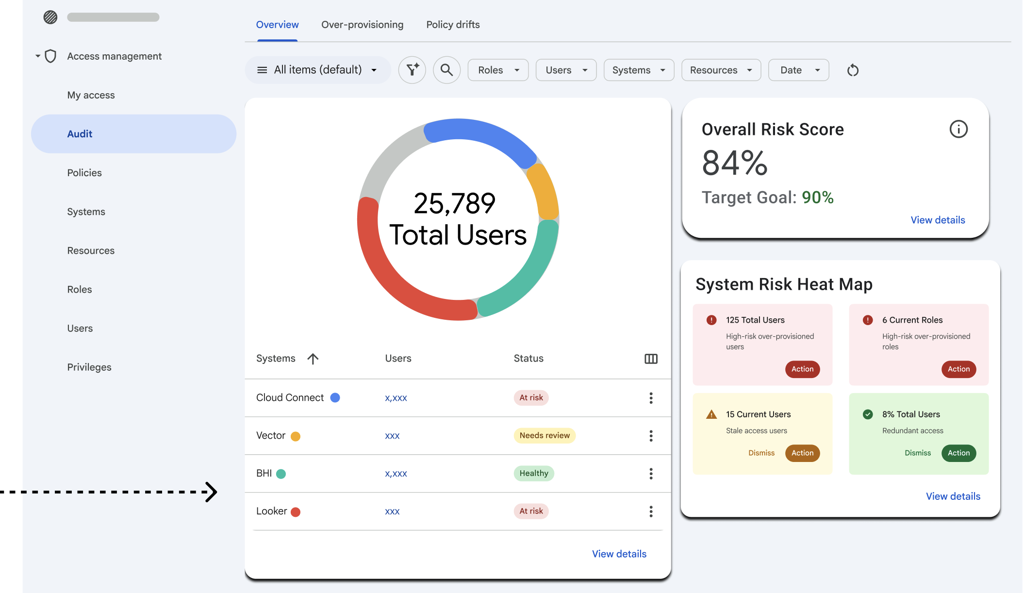
This early prototype showcases some of my exploration surfacing an overall risk score, total user count, and a system-by-system heat map on different cards.
Roles, identified & categorized
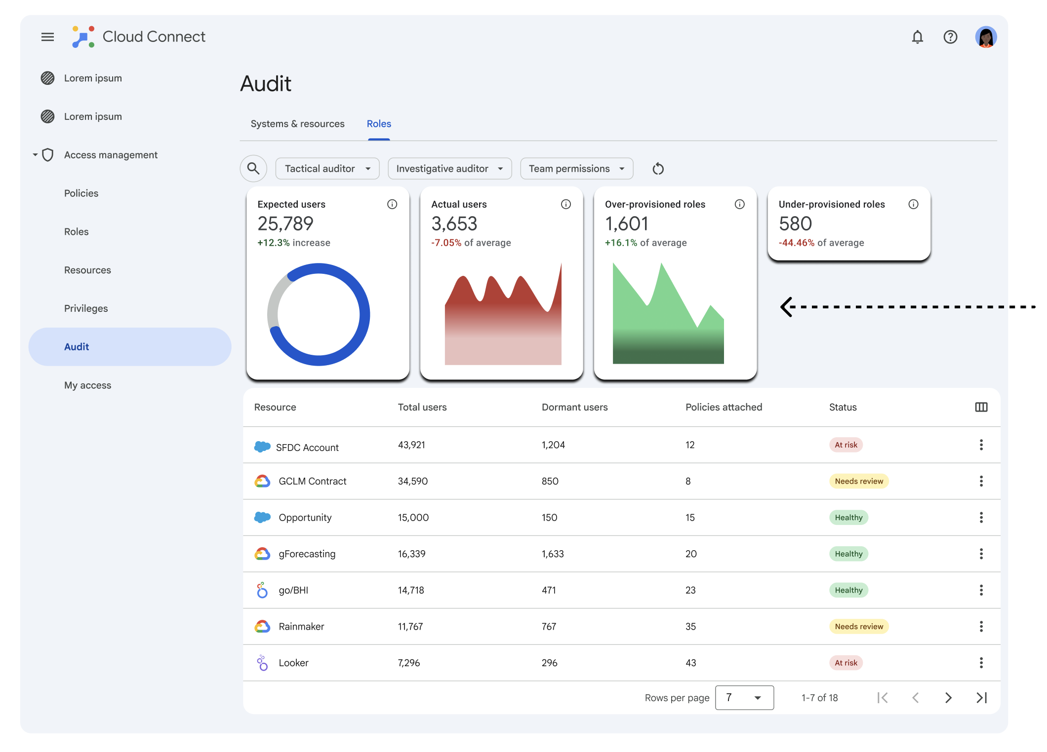
Through more detailed research, I was able to consolidate these initial four categories shown into a simpler cut of data categorization, roles with zero users, roles with stale access, and users with redundant access.
Provisioning, filtered
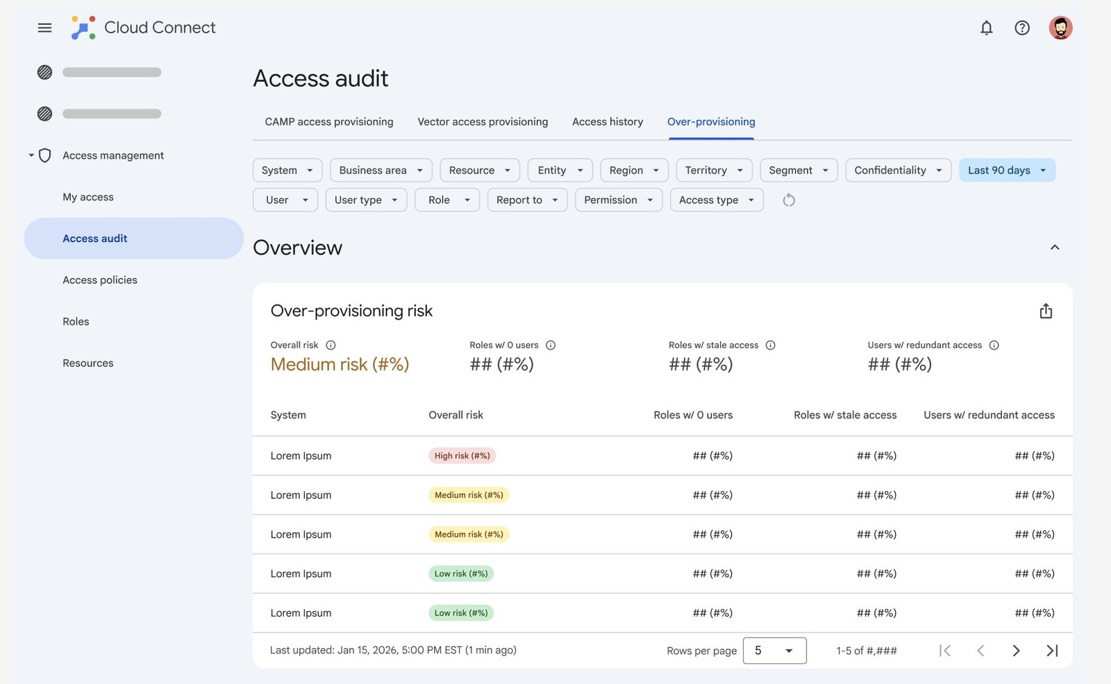
Further along in the design iteration process, a need for Auditors to be able to filter specific categories for risk by system, business area, region, or role, surfaced as priority in concert with data freshness. The investigation that used to mean exporting five spreadsheets now happens in one filtered view.
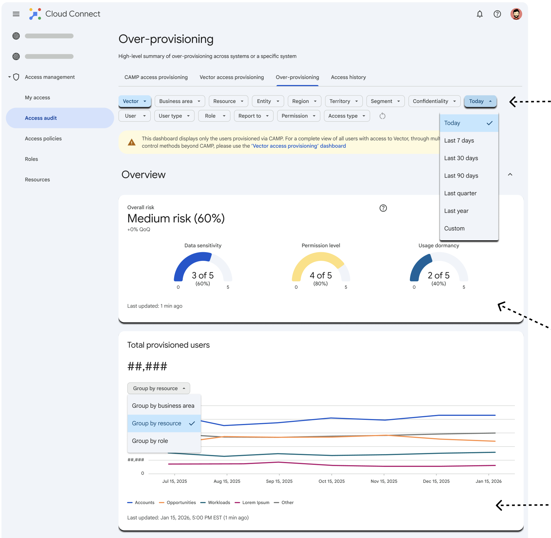
AI Prototyping, 1:1 Ratio
I vibe coded this dashboard using an internal Google AI tool to match my Figma prototype. Despite almost looking identical to the version I handed over to the engineering team, some design facets such as the logos, avatars, and icons, didn't easily transition.
Eng hand-off
From Figma to production
After stakeholder alignment from weekly meetings and several rounds of usability testing, my designs were validated, allowing me to have a successful hand-off directly to the engineering team. The finished product was shipped, transitioning from a prototype, to running live in Cloud Connect.
Impact
My designs pushed the organization from a reactive, crisis-driven mode into a proactive one where security and compliance are just happening all the time, automatically in the background.